Client: Shake Tree
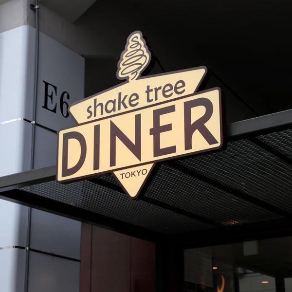
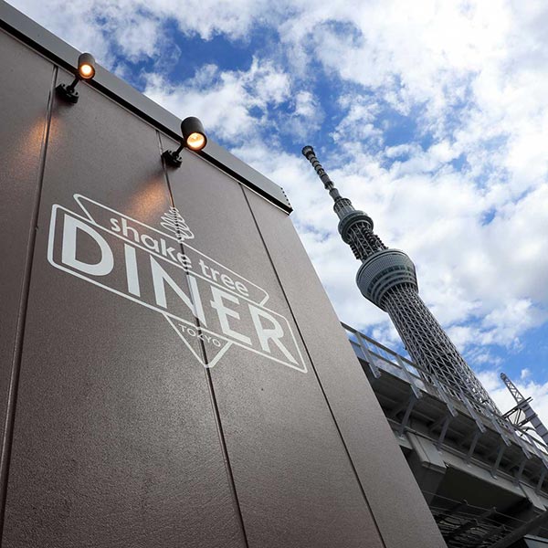
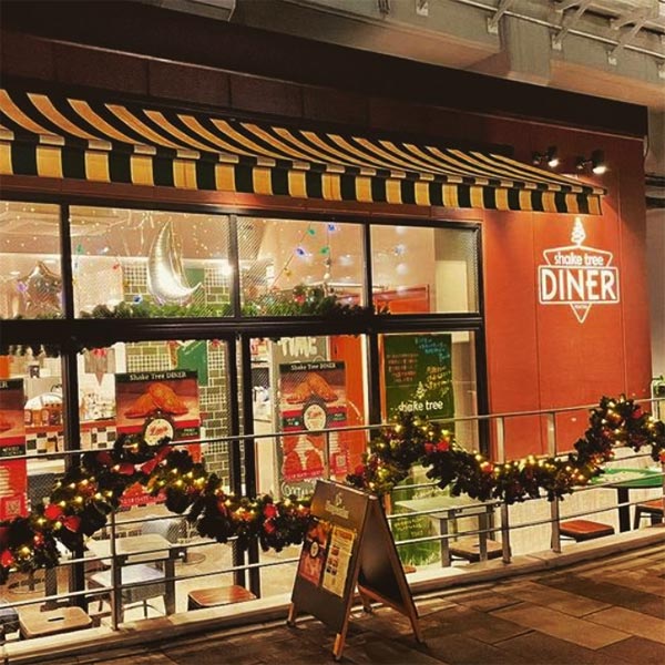
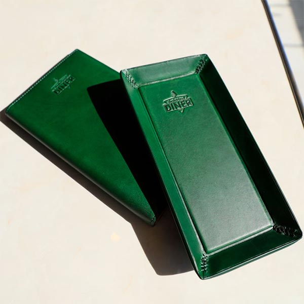
Shake Tree, operator of Shake Tree Burger & Bar in Tokyo, decided that their second location would be a diner with classic American style. Starting with the original Shake Tree font and their “spiral-tree” symbol, we set out to create a logo. The colors were taken from the cars on the favorite train line of Shake Tree’s founder. The design aims to combine a bit of a railroad sign and a retro feel. It can be seen all over the restaurant and its goods.
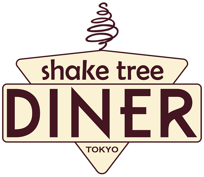
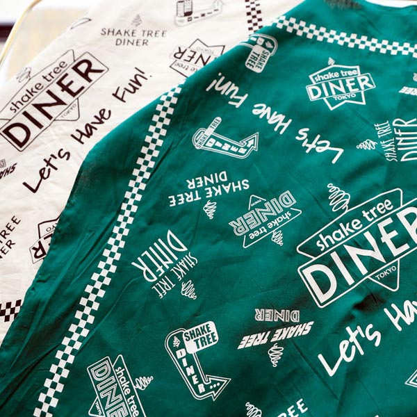
A variety of styles and iterations were proposed before the above logo was chosen. It was a difficult choice and there was a great deal of appreciation for the versions that weren’t chosen. So much so that, when producing a limited edition Shake Tree handkerchief featuring the original Burger & Bar location and the Diner, a handkerchief displaying some of the potential designs for the Diner logo was created.
